SABRINA
Sabrina is an entrepreneur from São Paulo who helps mothers and expectant mothers to connect more with their body, making the birth process and its cycles a more pleasurable and natural experience.

SÃO PAULO | 2019 | BRANDING
Sabrina is an entrepreneur from São Paulo who helps mothers and expectant mothers to connect with their body, making the birth process and its cycles a pleasurable and natural experience.
Around 2016 Sabrina decided to give a new direction to her personal and professional life, allowing her to deepen the knowledge of her work, to seek new inspirations and complementary techniques, and to improve her role and relevance in the ritual of her clients.
She believes that we need to look at motherhood with empathy, care and respect in order to give this special moment the individuality it deserves. Her purpose is to guarantee that gestation, delivery and postpartum occur harmoniously, attending a woman’s needs. Ensuring, through physical and emotional development, a safer, healthier pregnancy that, above all, respects the history and expectations of the mother-to-be.

THE CONCEPT
The phases of pregnancy compose a cycle. It starts with an abrupt change in the “normal” conditions of life, with the euphoria of discovery. Then, the body itself starts changing, along with the mind. As the birth comes closer, changes become more intense, until the very challenging arrival of a new life. The concept for the brand’s identity is all about these cycles. The phases, the idea of change and movement.
To bring her business to life, a brand positioning that reflected her purpose and values was created, followed by a branding process that gave it shape and meaning.

the logo and symbol
The “S” from “Sabrina” gives life and shape to the entire brand, in an organic, fluid and natural way.
Having a symbol adds personality to the whole identity. And, as it can be used independently, it helps the audience remember the brand in a variety of applications. The circle is a visual representation of a cycle and its movement suggests both energy and power. The rounded lines are linked to the human shape: in a subtle way, we can see the body of a pregnant woman.

A sans serif, rounded and distinct - but close - typeface appeals to simplicity and complements the geometry of the symbol. Besides preserving its readability, the way the logotype is built refers to the challenges and surprises that are part of the journey of motherhood.


GRAPHIC ELEMENTS
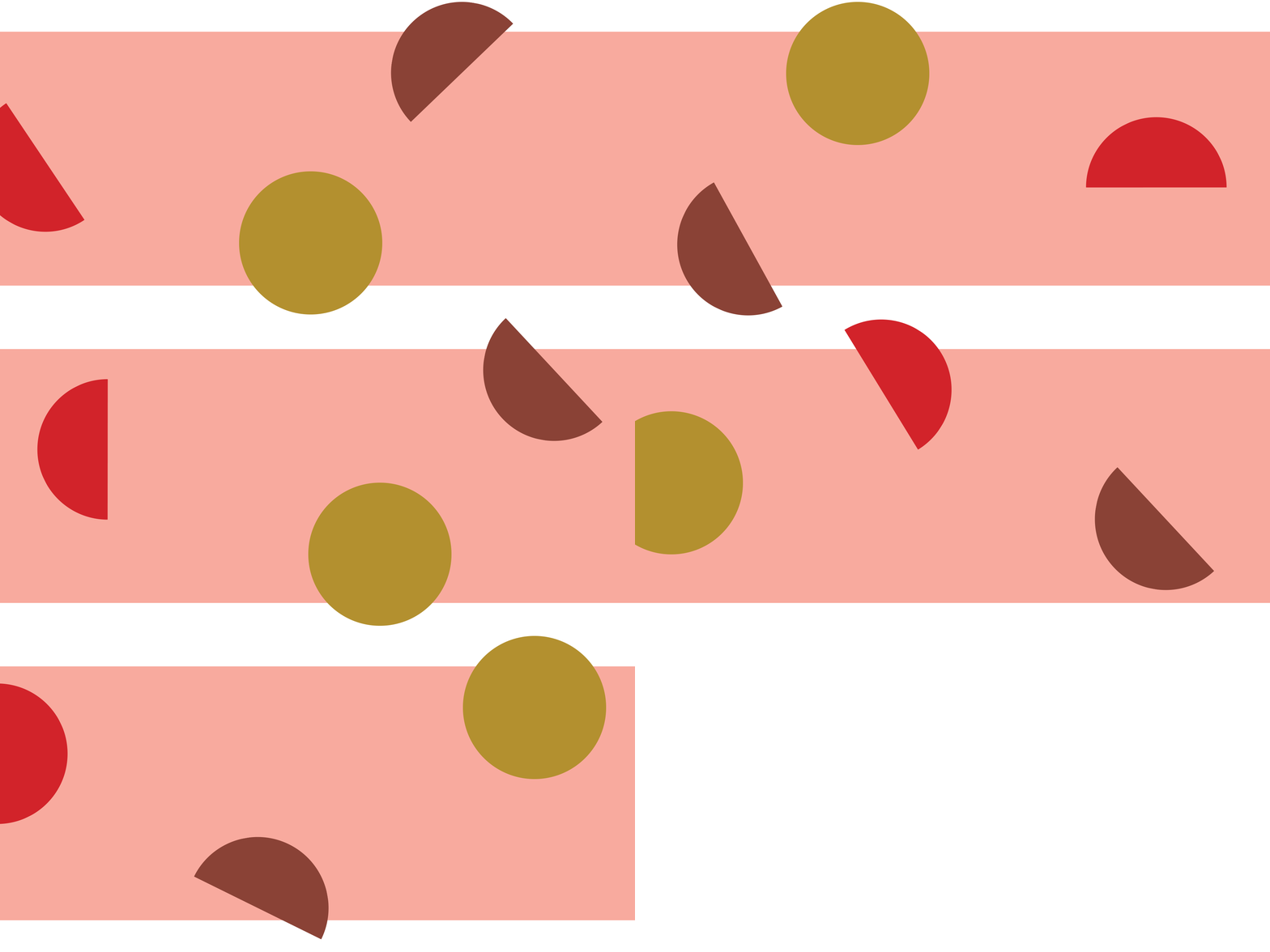
Exploring the geometric shapes and using them in playful ways and in different contexts brings even more expression to the brand.


COLOUR PALETTE
The colour palette aims to be mostly feminine but in a less traditional way. The pink was used in a light tone to enhance the smoothness and tranquility, earthy colours such as the green and brown, both associated with natural products or ways of living, were also added. The red brings energy and love, giving it some punch.
All were combined to create a surprising and dynamic palette.


iconography
Sabrina aims to take care of the mother in every step of the way, with different services. For this reason - and to make the communication easier and intuitive - icons for each phase were created.
The same geometric shapes, always a deconstruction of the circle, were used to create the iconography of the brand. Icons were created to represent the company’s products and services and to add value for the communication in a coherent, expressive and creative way.


Click here to check out the website.
