


Libeen is a new real estate concept that wants to revolutionize the way you purchase a house.
Libeen is an online real estate company that started in Madrid but wants to reach more Spanish cities and abroad with a new concept of buying. Considering the increasing difficulty that new generations face when buying a home, given the disproportionate rise in property prices, especially in the city center, and the lack of economic stability, this real estate aims to simplify and streamline the sector by creating a new rent-to-own option.
The goal was to achieve the subtlety and balance between the insertion of the brand in its category and the disruption it wants to achieve, creating a simple and extremely straightforward language that can communicate its positioning.
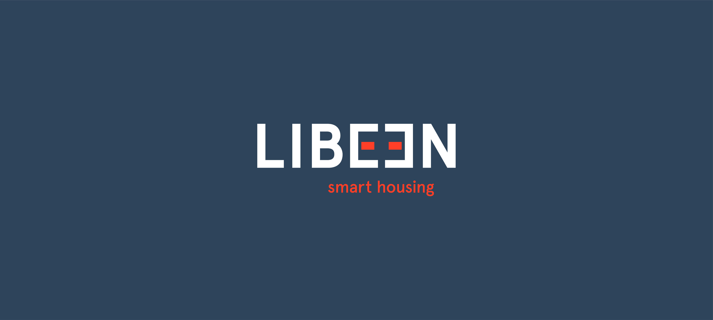
With a straightforward approach, the logo includes graphic elements related to house, but more metaphorical than those used by its category. In addition, it is the beginning of storytelling that will be then be told by the other graphic elements graphics used in the communication. Taking advantage of the repetition of the letters “E”, which are a distinctive feature of the name, we draw the attention to the dots that will be then connected by a line. Also, the logo has a reduced secondary version, which makes it more versatile.
Derived from the logo, the graphic elements refer to architectural plans and therefore the concept of home, without using the most obvious elements such as roofs or the most literal shapes of house or building. The line, derived from the letters “e” of the logo, materializes the connections that Libeen intends to make in people's lives and brings the possibility of movement and dynamism to the identity.
The choice of colors followed a similar logic for choosing the other elements. The red integrates the identity into its category, but with the intention of disrupting more than integrating, we use it as a secondary color and add another tone for warmth and humanism. The blue takes the lead and balances as a solid corporate color.
Some applications, both print and digital, were made, maximizing the various elements of the visual identity on each platform.