
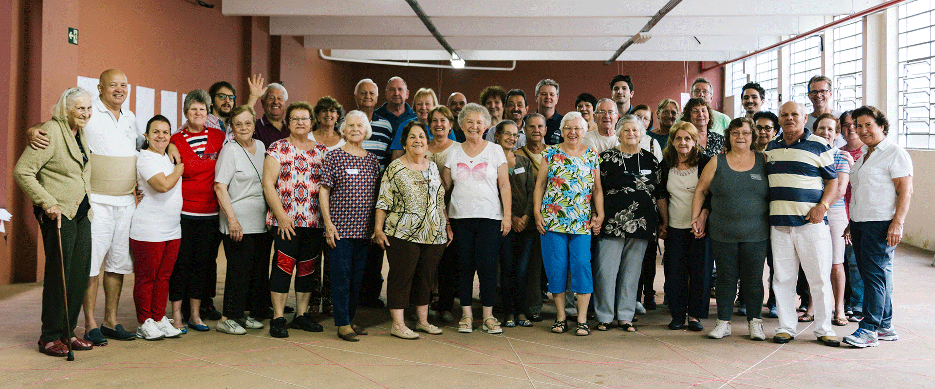


Convita it’s a house that welcomes the “new italian family”, looking at the lives of the elderly from another point of view.
Convita is a house that welcomes the “new italian family”, looking at the lives of the elderly from another point of view.
Patronato, the company's original name, was born in 1950 after the war. It began as a social institution supported by three Italian families whose initial objective was to welcome and direct newcomers to Brazil's labor market.
Over time, the institution was passed on to new generations and began to become a "weight" for the heirs. 68 years later, provoked by the current situation of the place and seeking to experiment with something new, one of these heirs and current president, Paolo Papaiz, saw an opportunity to create a social enterprise that could really transform people's lives.
A behavioral diagnosis supported the repositioning of the business, and we materialized this new moment with the creation of a new brand and identity.
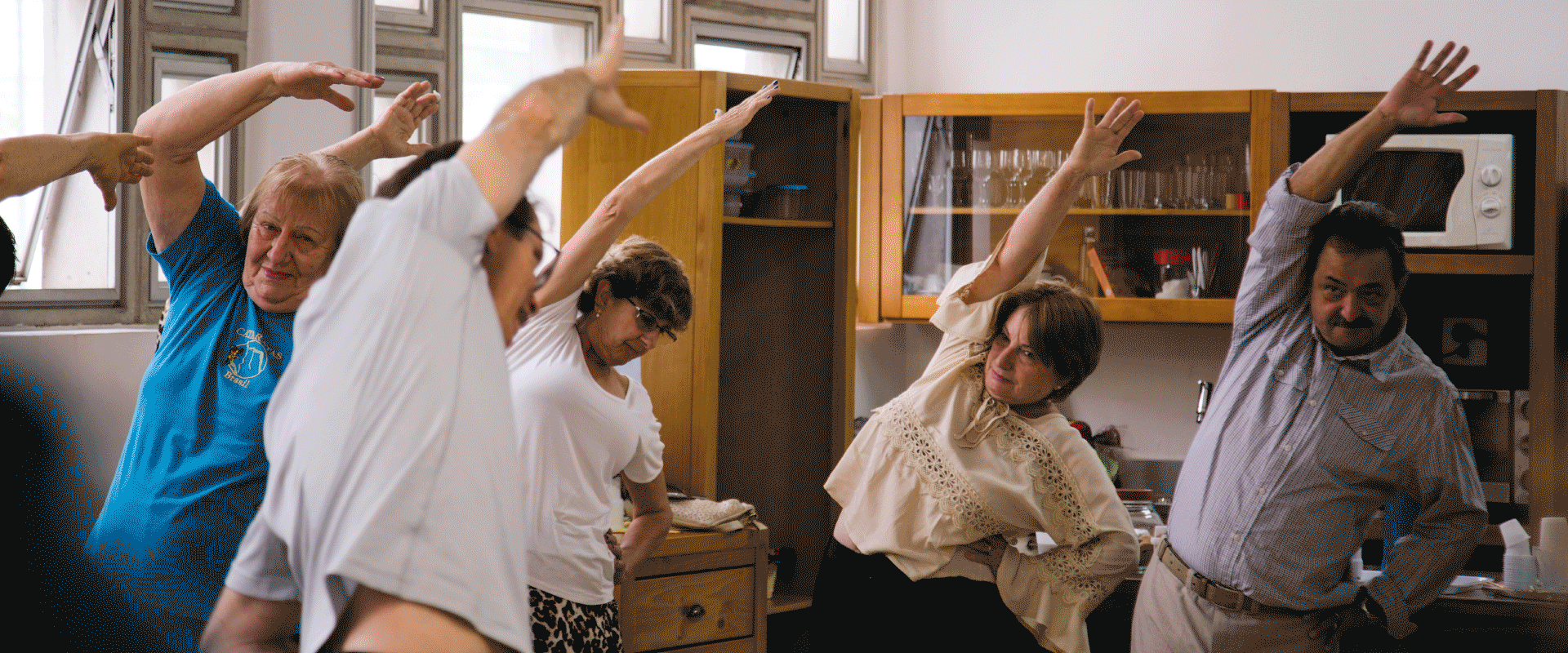
The new positioning invites the user to reflect about seniority. To think about how can we consider this phase as an opportunity to start over, enjoying every minute of it and doing what we like best. Convita wants to take a new look at people's health and offer quality of life to its members through three pillars: physical, mental and emotional. Its goal is to provide new activities, programs and projects, transforming the lives of everyone who joins this community. And instead of being focused on Italian immigrants living in Brazil, they open their arms to all who sympathize or have any connection to its culture.
The former “Patronato” no longer made sense as a brand personality. The name Convita, that comes from “convidar”- which means “to invite” in Portuguese - comes to reinvigorate the moment of the institution and its new positioning. A name that represents the feelings of welcome and open arms, a constant invitation for people to join. In addition to including the word “vita” (which means “life” in Italian) and pays homage to its roots, it also underlines that inherent energy and joy of life the project wants to foster.
The logo is meant to bring a new energy for the brand. Instead of focusing only on history and seniority, we bring a flash of modernity and simplicity, making it also very easy to read and uncomplicated like life for the elder is supposed to be.
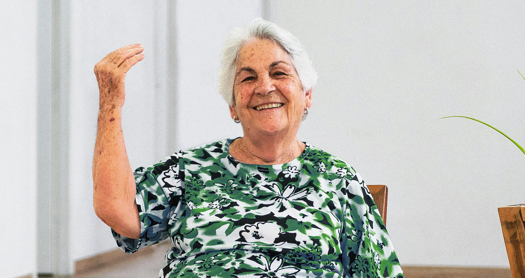
The oval shape and structure of a stamp refer to quality, tradition and history. It is a way to reaffirm our positioning through a graphic element. We used the same typography as the logo’s signature, creating a direct relationship with it and strengthening the identity. The hand makes a typical Italian gesture, usually used to reinforce verbal expression and here we use it to strengthen the origin of the brand.
In addition, the symbol gained so much expression that it was transposed to the communication, where it is represented literally, both in videos and photos, by the users themselves. Commonly used in challenging situations, the symbol was also embedded in the tone of voice. As such, phrases like "Who said I couldn't start over again?” or “Who said I’m too old to practice yoga?” are used along with it.
Green is the color that connects both countries and cultures because it is present on both the Italian and Brazilian flags. In addition, it is the color of hope, health and vitality.
Orange brings warmth and represents joy, vitality, prosperity.
Beige for balance and tranquility. It is associated with tradition.
A sans-serif typography but with a vintage feel that brings closeness and humanism to the brand. To balance, the signature has a serif typography that reinforces the tradition, culture and history from our positioning.
The iconography follows the same graphic line of the stamp, with continuous lines. Icons have been created for each activity so that its identification becomes faster and more assertive. In addition, they will help in many other points of the brand’s communication.
Materials have been developed for different purposes.
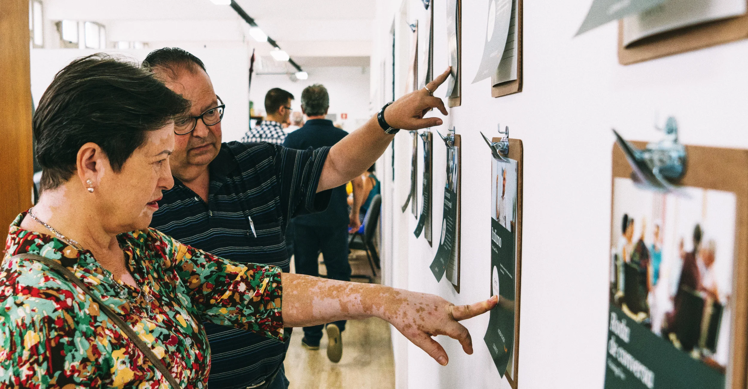
Their already existing newspaper - distributed internally and externally - was redesigned. Another explanatory printed material of the institution, its objectives and challenges have been created to attract more sponsors and investors.
The site has been redesigned to show the new identity and to make it more appealing. Also it now serves more purposes and has become more useful for its users.