


PROS is a PR company based in São Paulo that believes in making an authentic PR. In a world of noisy communication, they are determined to humanize and strengthen the relations between brands and their audiences.
PROS is a PR company based in São Paulo that believes in making an authentic PR. In a world of noisy communication, they are determined to humanize and strengthen the relations between brands and their audiences.
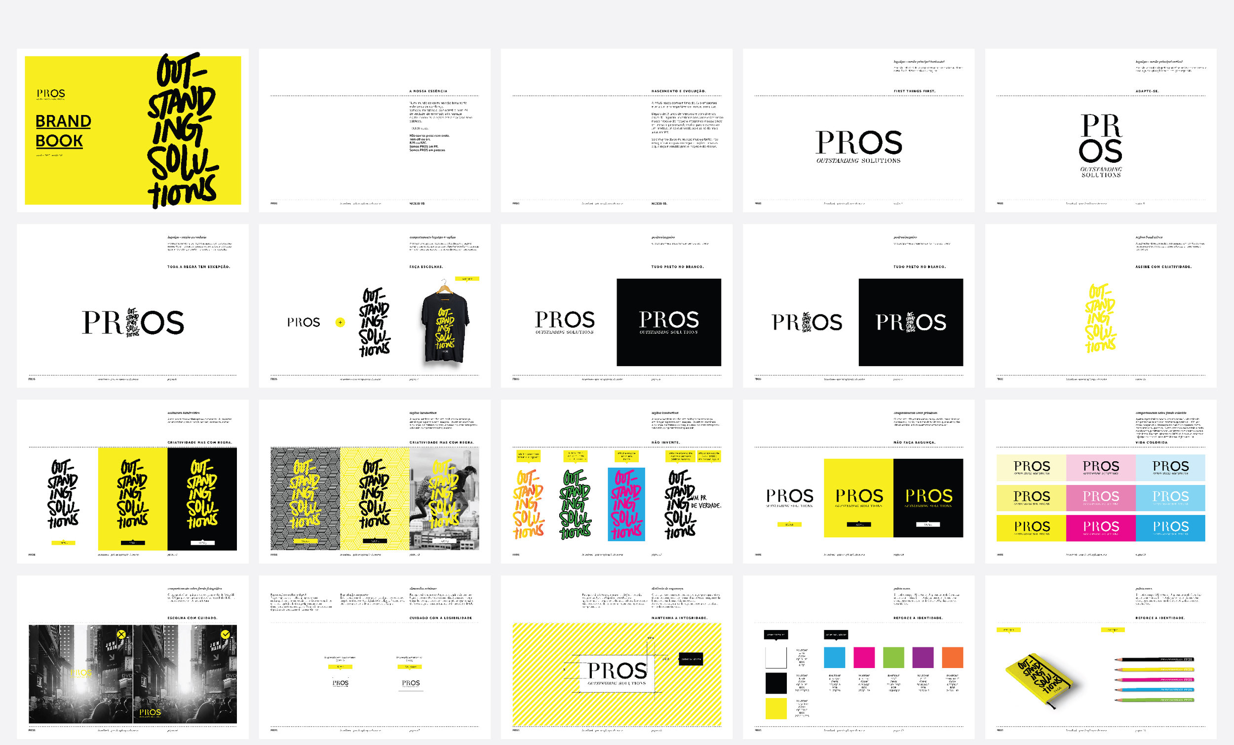
This revamp was the materialisation of a repositioning process, which aimed to give a new purpose to the company.
The logotype and signature already existed and only needed refinement. From there on, everything was created from scratch to reflect the company’s new positioning.
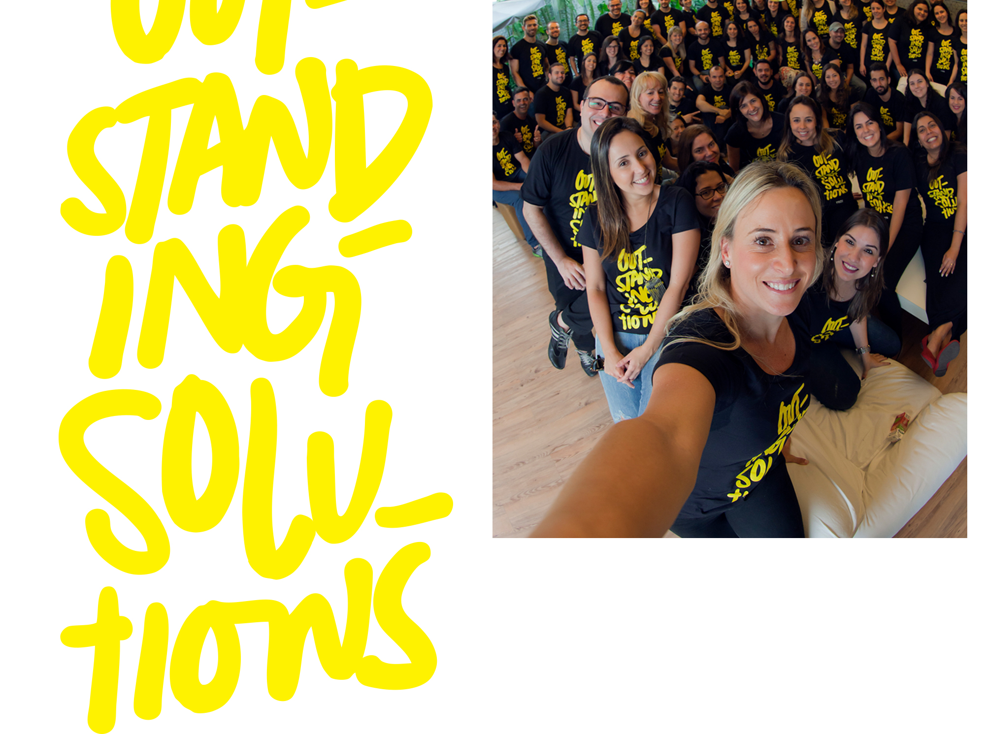
The handwritten signature, also refined, was kept in order to give the brand’s communication more expression and a human quality.
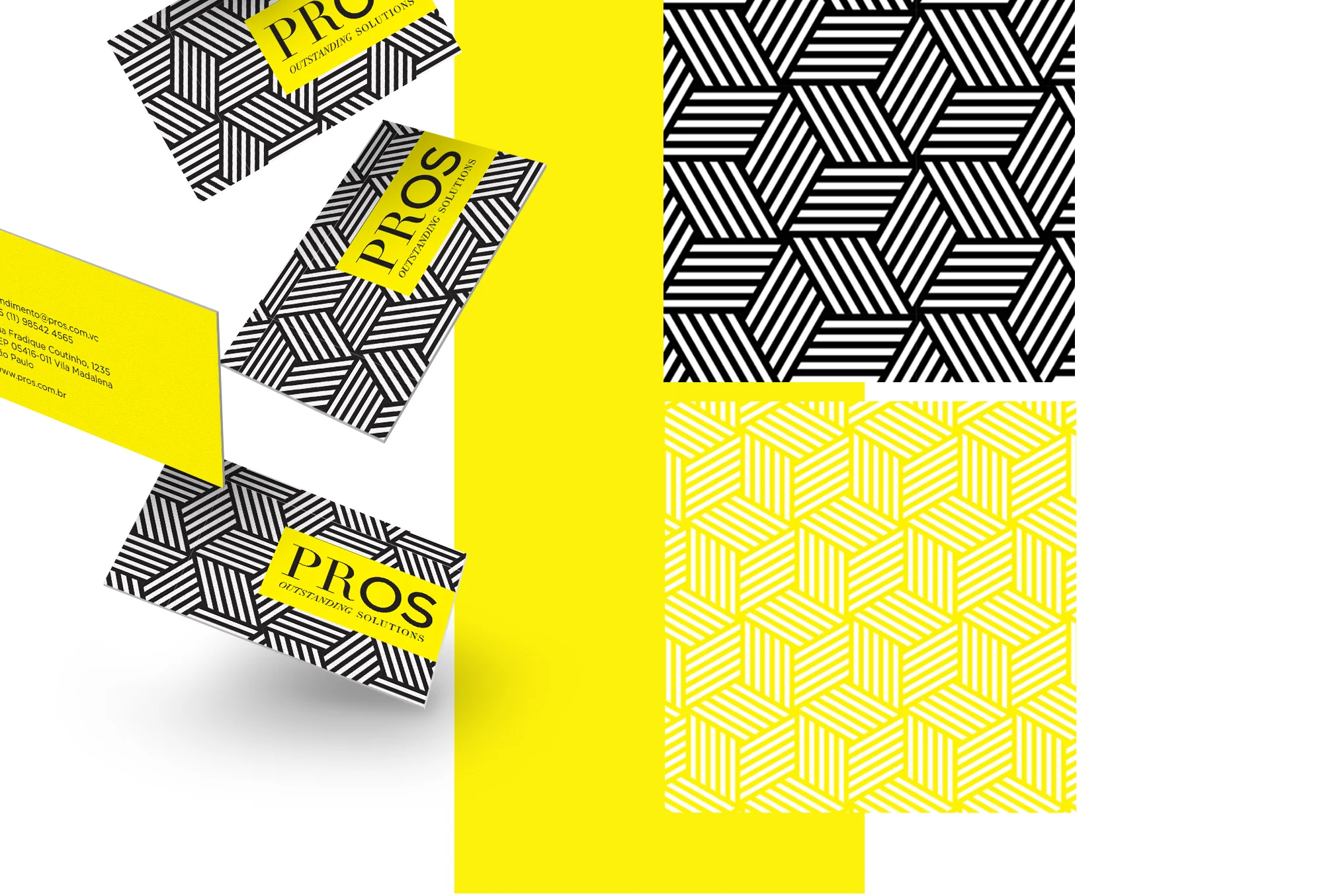
1 geometric pattern, that can be used in both colours, for all institutional materials.
8 directors, 8 teams, 8 patterns. Each director chose their own ir order to give them a bigger sense of belonging.
Each team uses their own specific materials. Having different patterns helps to organize and recognise each one of them, either on digital or print.
The new branding was widely implemented in materials that were to be used both internally and externally, by all staff members and also by clients. Depending on their purpose, they can look more institutional, using typeface and pattern, or more fun, using the handwritten typeface to create a PR related catch-phrase.
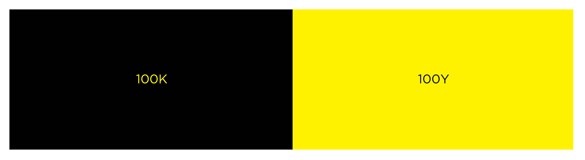
Black and yellow are the colours that allow the best contrast among any others. With that in mind, the colour palette was kept very minimal, making the most of its impact.