DZN
DZN. Is a consultancy based in são paulo that is dedicated to developing, helping grow or strengthen companies through a process that includes strategy, design and love.

SÃO PAULO | 2018 | REBRANDING
DZN is a consultancy based in São Paulo that is dedicated to developing, boost growth or strengthen companies through a process that includes strategy, design and love.
DZN was born of the love and concern of a couple who chose to create a business in a different way and works mostly with small/medium entrepreneurs and startups. Balancing the importance of learning and results, the model was designed to strengthen companies that want to generate impact and people with a story to tell.
Since 2008, there have been countless companies and businesses transformed. DZN works with entrepreneurs who want to be relevant in the market in which they operate. People who see profit as a means to a greater transformation.

THE CONCEPT
The main concept was to mirror the company’s daily routines. It’s about how things are thought, created, done. It’s about the small things, the habits, patterns, its intrinsic and authentic being.

the logo
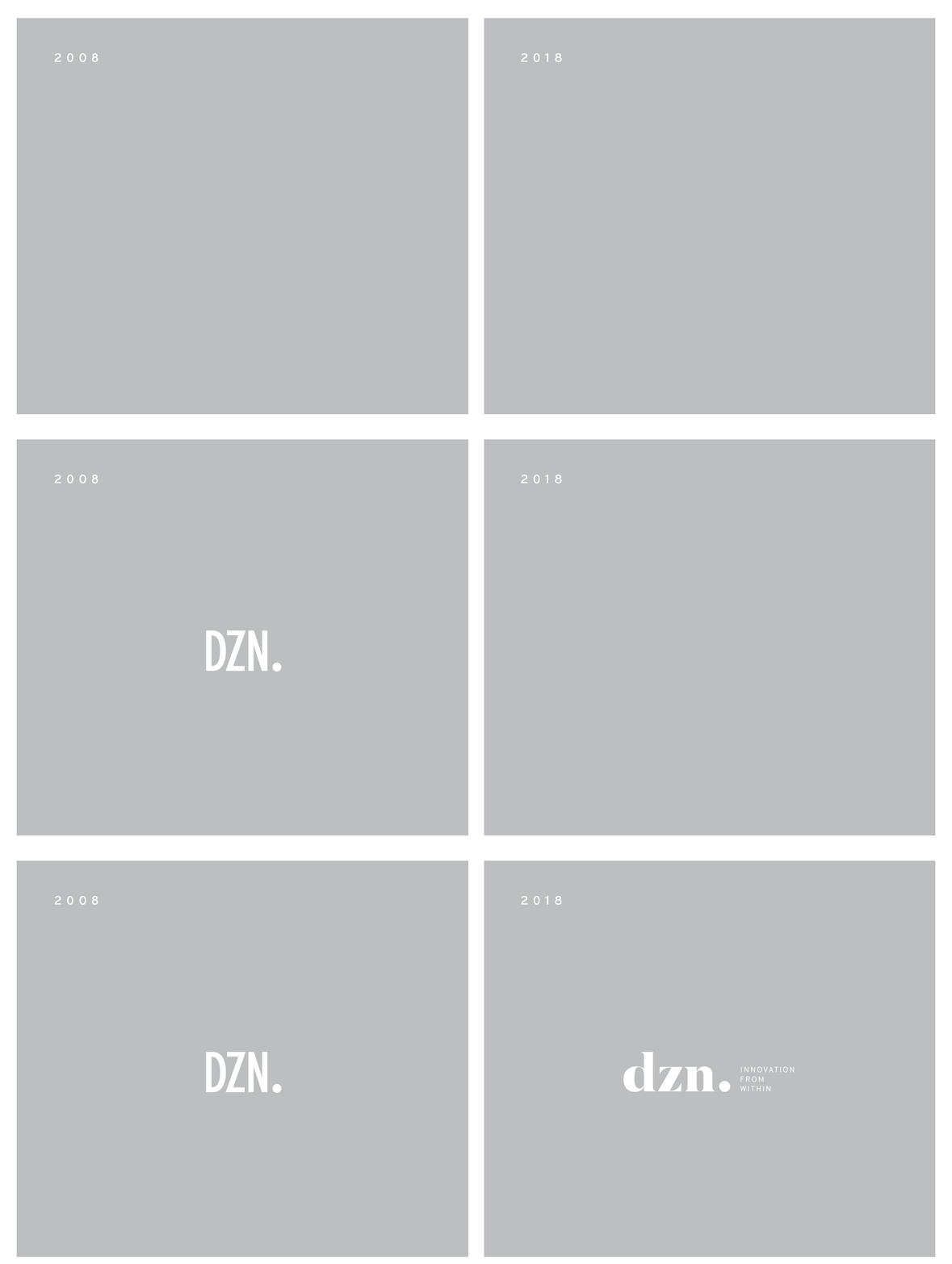
Given that most elements of the brand’s identity are so laid-back, bright and energetic, the logo is what grounds it. The serif typeface relates to the company's experience and confidence. A lower case was used for balance, creating a subtle - yet perceptible - friendly tone for the brand.


the gradient
The gradient is the primary graphic element of the brand. DZN has its own special energy and so, instead of having a single color or shape, it embraces a vivid, energetic gradient, creating its own unique aura.

GRAPHIC ELEMENTS
The daily routines of the company were the inspiration for the graphic elements. Thoughts are put into rough doodles and ideas come to life through quick sketches, turning strategies and design concepts into tangible actions and materials.


COLOUR PALETTE
The color pallette was inspired by one of those routines: the post its and their vibrant colours, used every day in so many processes.
Besides, each colour is used to represent a specific area - design, strategy, people - making them easily recognizable.


photographic style
Overlapping photographs of the team with the "aura" is a simple and assertive way to display the brand's positioning.
The brands photographic style also prioritizes minimal, straight-to-the-point pictures, allowing the theme and colour to live up to their importance.


typography
Two different typefaces that complement each other, creating the perfect balance.


