


Two daughters of a shoemaker have spent all their childhood playing in the warehouse that was in their house’s basement. And among all those shoes they started dreaming about the day they would create their own shoe brand. That’s how Atos was born.
The tradition is in their blood and in their hearts. They wanted the brand to express this connection between the past and the future. It is about taking care of every kid’s next steps, choosing only quality shoes and preferring national suppliers, building a brand that breathes comfort and quality.
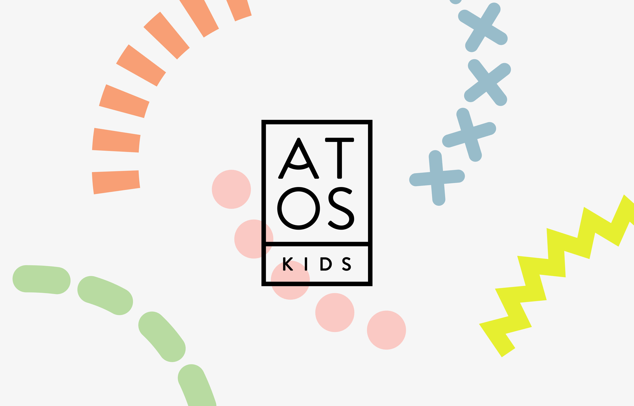
Aiming for a connection between tradition and the future, the logo has a geometric composition that accentuates the vintage tone but at the same time adds a modern quality. The sans serif typeface with a retro touch is geometric but with rounded ends, which makes it friendlier.
Giving special attention to the letter A from the logo that invokes a smile, we built multiple versions of the symbol where every rounded bar is made from each one of the graphic elements, making it playful and dynamic.
The typeface follows the same concept as the logo. A vintage feeling yet simple and geometric to give a modern twist and with the same rounded and friendly ends.
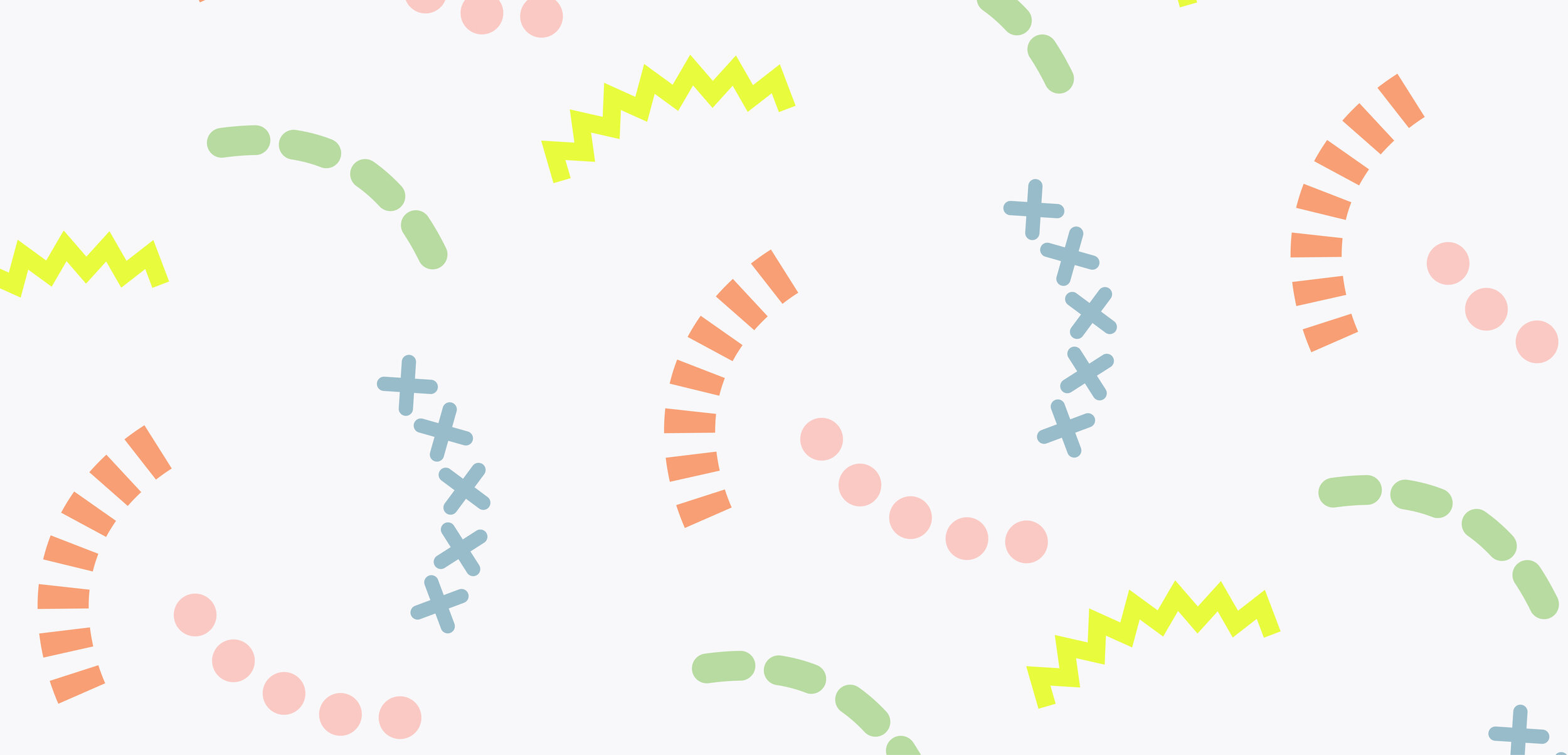
The graphic elements are based on basic geometric shapes, as they are the ones that most easily stimulate children in their development. They always form the same line, which invokes a smile and can be rotated, creating movement and making them fun and playful.
The colour palette is composed of essentially primary colours in pastel tones but a neon tone of yellow was added to makes it punchier
Using the graphic elements we already have, the pattern is just another way of using them with more structure and ease.
The shoe box brings every element together. The geometric lines from the logo are continued making a new structure where information can be easily organised and read. There is an empty line to be filled by hand with the name of the kid to whom the shoes will be for. Also, instead of having a different box for each size, all the sizes are numbered and can be ticked by hand.
There is a special detail for the wrapping with coloured paper sheets and small tags alongside the symbol, showing how personal the process is and how each customer always gets special attention.