


Protto is the masterbrand of a company, based in São Paulo. It develops DIY-related products in order to educates people on technology-related topics. Its goal is to democratize and make the far-fetched world of high technology a lot more approachable.
Protto is the master brand of a company based in São Paulo. It develops DIY-related products in order to educate people on technology-related topics. Its goal is to democratize and make the far-fetched world of high technology a lot more approachable.
Protto was born to transform the concept that technology is for the few, helping people to "do magic" with their own hands, through transformative and light-toned experiences.
In order to make people makers (creators, builders), they want to stimulate the learning processes involving technology through the construction and deconstruction of everyday products.
They believe that by creating a bigger connection with a product, they bring more awareness to its creation, helping to disseminate an intelligent and sustainable consumer culture.
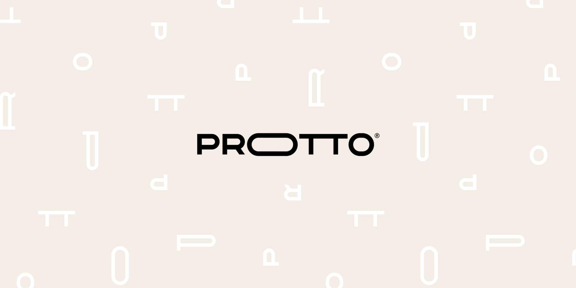
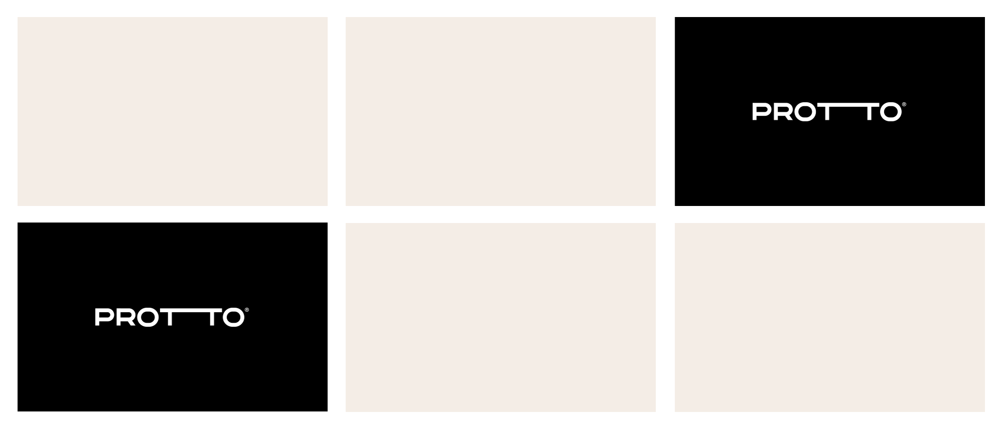
The most important feature of the logotype is its expanded type. It is a metaphor for expanded horizons, for going further, for achieving beyond your limits. Also, this kind of “lower” typography gives a better feeling of technology, while the sans serif typeface, that was all built from scratch, shows humanization and proximity. Its animated version will be especially expressive in a digital context, while when printed, all the versions will be used randomly, with no primary or secondary version, showing versatility and freedom.
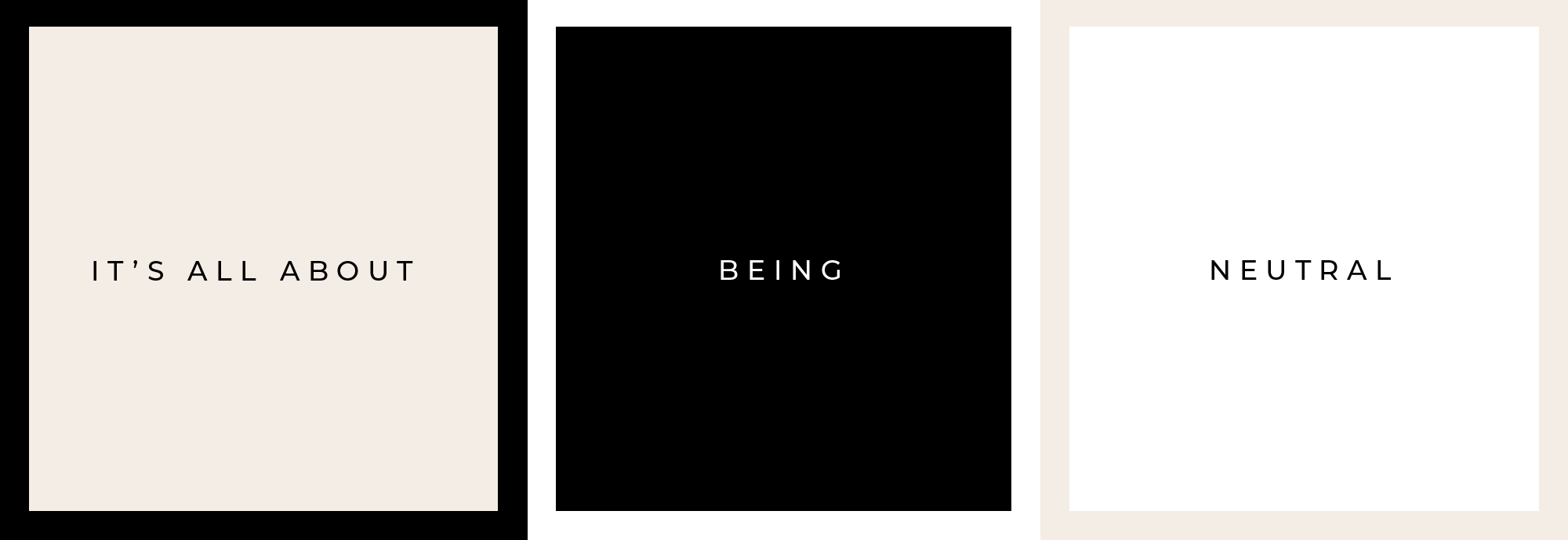
Because it is a master brand, there was a concern that the palette would not compete with the brands that will be endorsed. Therefore, the palette is primarily neutral but with the necessary contrast to have impact. In addition, being neutral allows it to be used as the base of the palettes of its endorsed brands and to coexist peacefully with whatever colours they adopt.
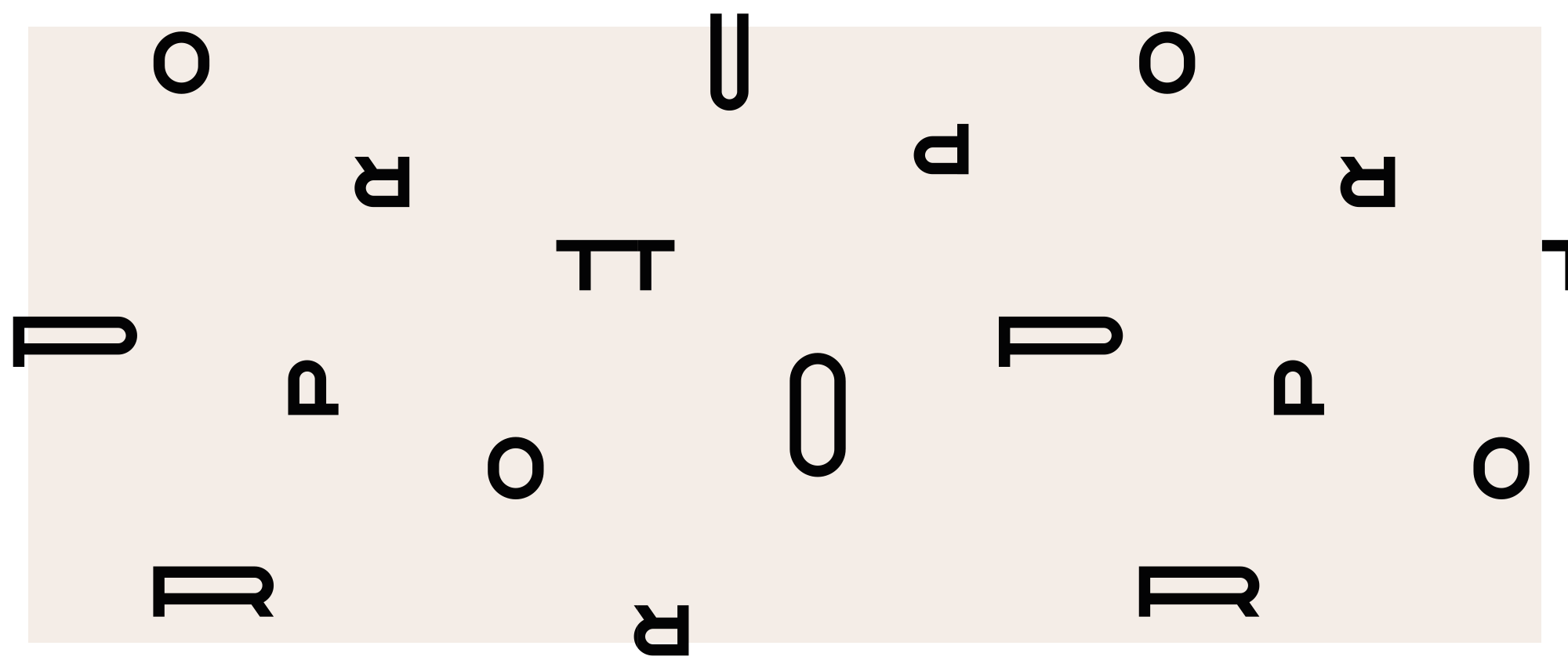
Based on the logotype, a whole expanded alphabet was created to be used as the keystone of the “look and feel”.
A sans serif typeface was paired with it, enriching the brand’s identity.
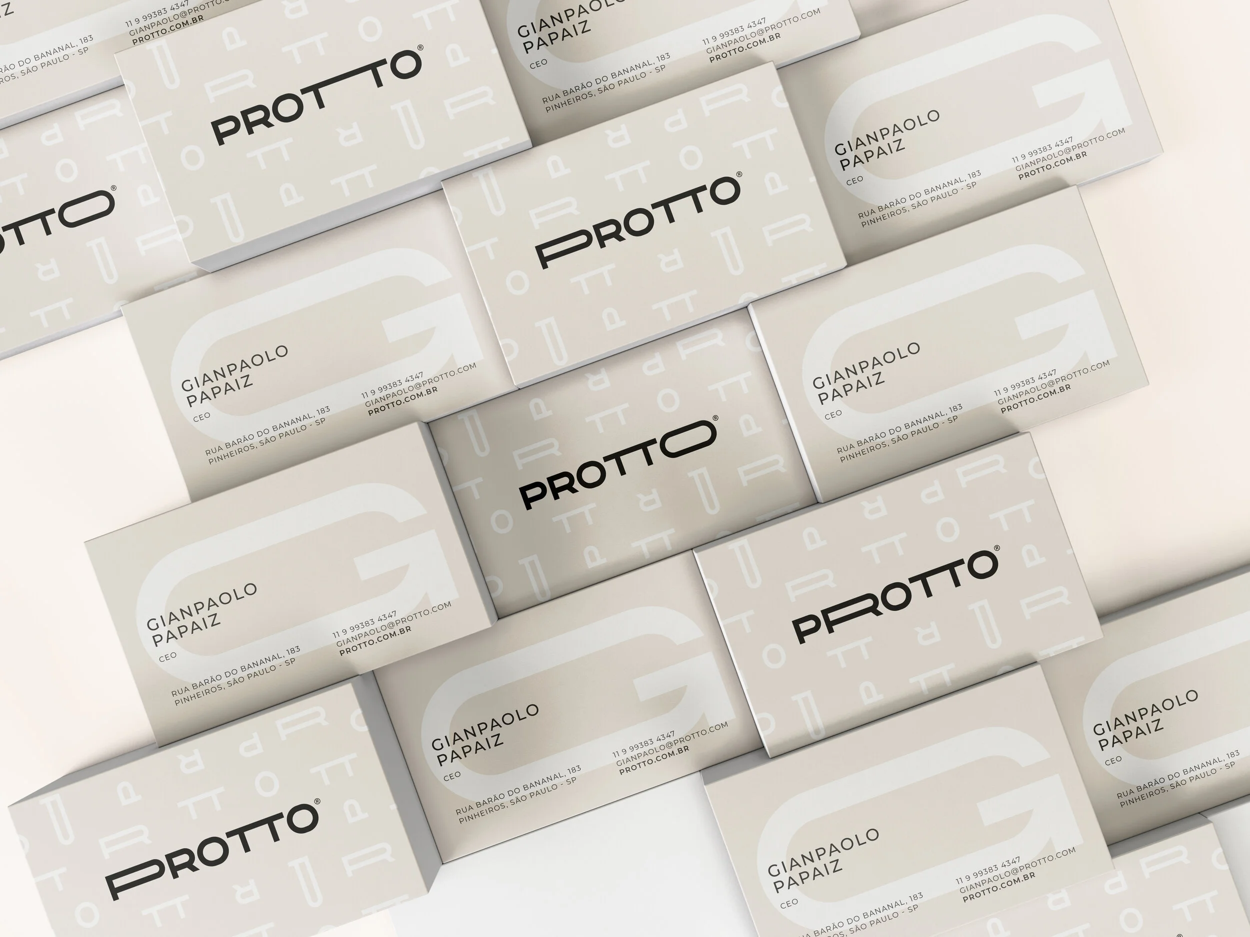
Using both the expanded and the “non-expanded” letters from the logo, looking in four opposite directions, the pattern was built to give the type an illustration feature. It relates to a “digital code”, bringing technology closer once again.