


181 Graus was the project I created and ran during the four years I lived in São Paulo. It was an oline store that sold hand sewn toys and decoration items for kids.
181 Graus was the project I created and ran during the four years I lived in São Paulo. It was an oline store that sold hand sewn toys and decoration items for kids.
I made every single part of it from scratch, from the branding to the photos, communication and the products themselves. It was an adventure through entrepreneurship, the chance to turn ideas into something that would eventually be a part of someone’s life and, if I’m lucky, to bring them some joy. With few rules, things came to life bounded only by my own creativity and sewing skills, with a lot of love poured into every single detail.
181 Graus exists to make the world younger. Through their handmade products - that know no labels, gender, sizes or collections - they nurture the ingenuity, the dreams, the relentless happiness and the boundless creativity that are craved in our hearts, no matter who and how old we are. The brand’s identity aims to communicate all that, in a joyful and easy way.
The logotype was the kickstarter for the brand’s identity.
It was actually from an older business I had in the past but it meant a lot to me. So I decided to keep the logo and name. Only the signature was added ir order to provide some context.
Most of the products had a meaning or told a story, so they needed their own name. That made them charismatic and memorable. In order to respect brand architecture, all names were created the same way - starting with the original word and giving it a story-related twist - and all the logos had the same structure.
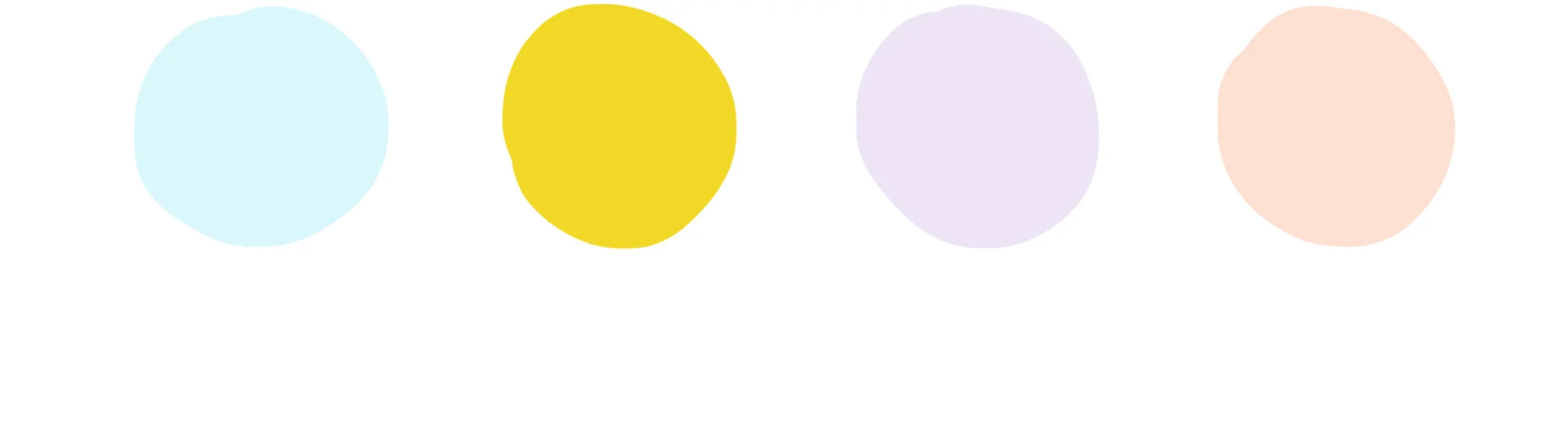
The palette includes four different colours, all in pastel shades aiming to be playful, fun and, especially, genderless.
Two typefaces to balance each other.
One more stiff yet rounded, for longer texts which demand higher readability.
Another one more laid-back, providing a sense of fun.
The brand’s photographic style is all about being simple, minimal and real.
The main focus is on the products, most of which already have the brand’s colour palete. A white background and little colour were added, showing the different parts of the process - from the sewing to the delivery and the people involved - all in a laid-back way and with a pinch of fun.